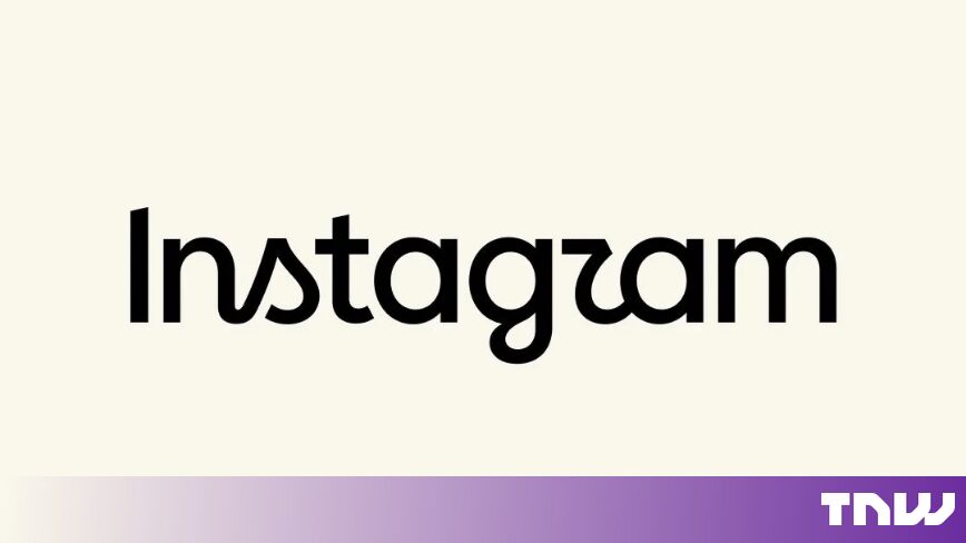
Instagram Head Adam Mosseri Unveils Redesigned Platform Wordmark
The social media platform introduces a updated logotype combining script and sans-serif elements in what leadership calls a modern refresh.
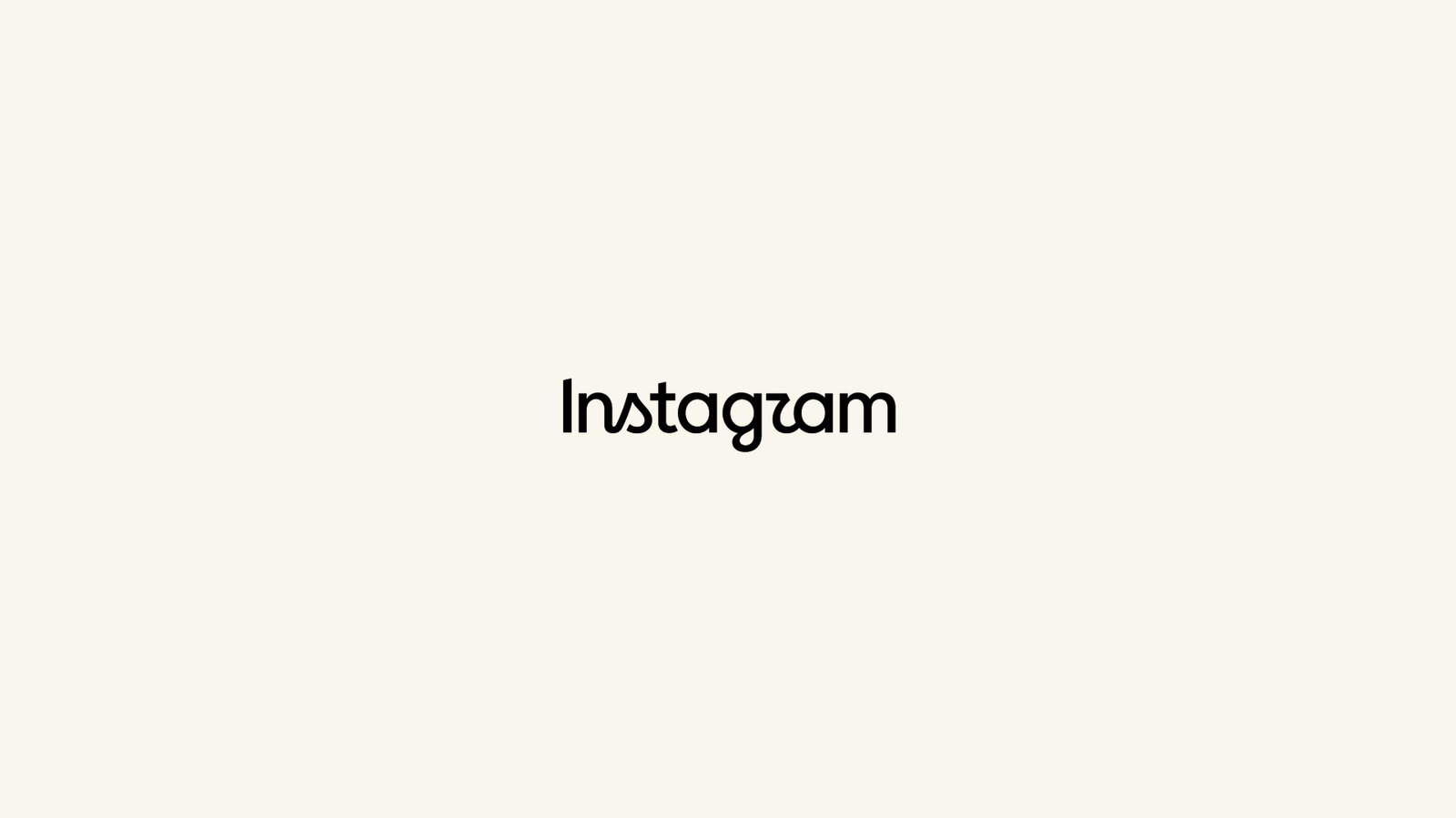
Instagram executive head Adam Mosseri unveiled a redesigned wordmark for the platform on Thursday, framing the visual update as a "cleaner and more modern" refresh for the social media service. The unexpected presentation introduces a modified typographical logotype for the Meta-owned app, marking an official shift in the company's core visual branding.
The brand update was first reported by Engadget, which noted that Mosseri provided brief commentary regarding the rationale behind the change. According to Mosseri, the platform leadership decided it was time to modernize the visual identity, though specific rollout timelines and broader implementation guidelines across the service were not immediately detailed alongside the initial reveal.
An analysis of the new typography shows a design structure that combines characteristics of half-cursive script with sans-serif print elements. The line work across the updated wordmark features curves that terminate sharply and unevenly, along with variable stroke connections between individual characters in the platform's name.
Among the distinct typographical details, the consecutive letters "t" and "a" feature a pronounced connection that sets them apart from adjacent characters. In contrast, the bottom loop of the letter "g" ends cleanly without flowing into the next character, while the letter "r" features a semi-connected structure within the sequence.
The visual balance of stroke connections and letterforms produces an overall appearance that can resemble the spelling "Instagzam" upon a quick glance. Engadget highlighted the stark typography choices in its coverage, pointing to the contrasting combination of disjointed script and print styles across the wordmark.
Despite the unusual combination of connected and standalone letterforms, the release represents Instagram's latest visual direction under current platform leadership. Neither Mosseri nor parent company Meta have indicated whether further updates to the mobile application's icon, layout, or wider design system will accompany the new typography.
Sources
Written by
The Company Wire
Inside the companies building what’s next. Reporting on startups, technology, funding and the people shaping them.